This is an assignment I received in Interaction Design with Cary–Anne. I created an online portfolio using the assigned color scheme and typefaces. I used a number of different motion elements. I thought my design choices balanced well and presented my work in a flattering light. This was my first attempt at coding but I can say this was an overall enjoyable experience. This was a challenging assignment but I am proud of what I produced.
This blog is a virtual collection of my work throughout college career at St.Edward's University.
Wednesday, March 28, 2012
Diagram: Graphic Design in Video Games
I decided to chose the popular game cover to NBA 2k12 to analyze. Upon further observation, I decided the two movements which influenced this cover the most included Pop Style and International Style. I pointed out different similarities between the three things.
Labels:
class_of_2013,
diagram,
Fall 2011,
Gaby_Flores,
gdes_history
Graphic Design History Paper
For this assignment I compared the development and design of social networking sites to the International graphic design movement. I needed to research both the graphic design history behind the Swiss movement and the development of social networking. I compared both throughly.
Labels:
book,
class_of_2013,
Fall 2011,
Gaby_Flores
Presentation: Plakastil
This is the non powerpoint I designed for a presentation I did in Graphic Design History on Plakastil. I researched the topic thoroughly and presented a 10 minute overview to my peers. My presentation style includes lots of verbal communication heavy with visual elements. It is not text heavy in any way.
Labels:
class_of_2013,
Fall 2011,
Gaby_Flores,
gdes_history,
presentation
Concept Map: Life Cycle of the iPhone
The assignment was to make a clear and comprehendible concept map. I chose to do a concept map on the life cycle of the iPhone because when we were given this assignment the iPhone 4s was just released. I included the entire life cycle from the development of the idea to the disposal of the iPhone. I did lots of research and tried to include it in a clean design.
Labels:
class_of_2013,
concept_map,
Gaby_Flores,
junior_studio,
poster,
spring 2012
Field Guide Book
I designed a field guide for graphic designers who are unfamiliar with the typeface used by different businesses on South Congress Avenue. I chose to do this because I was curious but what typefaces are used. I went with a simple color scheme as not to take away from the typeface being featured. I also made it pocket sized so that it could be taken into the field if necessary.
Labels:
book,
class_of_2013,
field_guide,
Gaby_Flores,
junior_studio,
spring 2012
Sunday, March 25, 2012
Locating Place: Book
I authored two books for the locating place assignment. I aimed to create the books to be non PDFable. I achieved this goal by creating a transitions of vellum in between the chapter sections. This was my first attempt at binding. I chose to do a long stitch which was featured through exposed binding. The focus of my book was to locate what makes people human. I did this by exploring and researching basic human behavior.
Labels:
class_of_2013,
Fall 2011,
Gaby_Flores,
gdes_III,
interactive,
locating_place
Locating Place: Interactive
This is an interactive piece I created for the East Side project. It was a complicated project in which I used Flash, Final Cut Pro, Sound Cut Pro, and After Effects. I interviewed different people from 3 different businesses. I edited the footage added music and added fun effects. Unfortunately I can not get it to upload correctly.
Labels:
class_of_2013,
Fall 2011,
Gaby_Flores,
gdes_III,
interactive,
locating_place
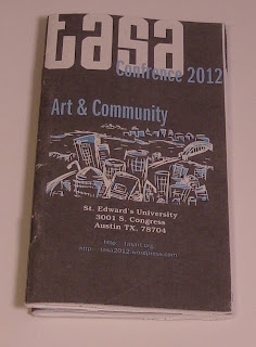
Activity Booklet: TASA
The TASA book came with a series of challenges which I had never faced before. I was required to go through pages of information which I needed to organize. Once organized it needed to be designed into a small book which could be easily read and accessed. I made it pocket size with a center fold out map. It technically is two books which are saddle stitched onto a long piece of paper which includes the cover and the maps.
Identity Series: Bauhaus
In the identity series assignment, I needed to chose a graphic design time period, design and organize a set of buttons, and create a poster. I researched and selected Bauhaus focus on. This movement is significant because it was not only a major turning point in Graphic Design history but it was also a historical school. Austin is a college town and this was a major influence on my decision. I designed 24 buttons. The show was to go on for 3 months and a button was to be released every week to 2 separate groups. Students received buttons which contained all 3 primary colors while general admission buttons all include a single primary color. I designed the poster to mimic an iconic Bauhaus poster.
Labels:
Gaby_Flores,
gdes_II,
identity_series,
poster,
Spring_2011
Kitchen of Meaning: Denotation
This was the Kitchen of Meaning poster and the word I designed around was denotation. The definition of denotation according to the Merriam–Webster dictionary "a direct specific meaning as distinct from as implied or associated idea; a symbol or mark." I chose to use graffiti as the center of my design. I felt that it fit the definition perfectly and would best illustrate the definition. Each letter within the word denotation were individual drawn and vectorized. I used helvetica as a mask to contain all of the graffiti shapes.
Labels:
Gaby_Flores,
gdes_II,
kitchen_of_meaning,
poster,
Spring_2011
Subscribe to:
Comments (Atom)


