
Saturday, February 12, 2011
Symbol Methodology: International Trade Final
This is a continuation of the symbol methodology assignment. This is a final series of three which best illustrated international trade as visual set. These symbols are on both a large and small scale in order to see if it would work regardless of where they would be used. I wanted to use clean easy to recognize imagery in a unique way. The thicker and heavier lines create a interesting dynamic with rounded black squares. I wanted to create a uniform look with the line weight, rounded boxes, and the illustration overflow.

Symbol Methodology: International Trade
This was my favorite assignment in Graphic Design I. The Symbol Methodology assignment not only had me go through several different brain storming ideas but also several critiques. A row of symbols were not only to relate with the overall category but also subcategories that related back to the main category. My main category was international trade while the subcategories evolved as the process continued. Each critique brought new ideas and better composed symbols. Below are a few of the original symbols that were built upon for the final composition.
Making Words: Material Studies
This was the final assignment in Image Methodology. The point of the assignment was to test different materials to create different words which related back to the material used. Then with all of the information and prototypes collected from the different material tests the results were placed into a process book. I really disliked this project. I was sick through a lot of it and did not do the studies correctly. I spelled out words on each instead of the letters.
Sunday, February 6, 2011
Map it Out: Cognitive Map
This is the final part of the map project. It is a map of the path from my apartment to the St. Edward's Fine Arts Building. The cognitive map is a map of thoughts and ideas. This has my path which is consistent through all three. I documented my experience through type using illustration sparingly. I wanted the type to stand out in the map so I used a bright red and bold text.
 |
| Cognitive Map |
Map it Out: Perceptual Map
This is a continuation of the map project from my apartment to the St. Edward's Fine Arts Building. This is the perceptual map. It is a map based on emotions. The map below illustrates how I feel in the mornings. Usually I am alert and paranoid which is shown with the exclamation points and yellow highlight. The path is in black and really noisy areas are shown with red rings.
 |
| Perceptual Map |
Map it Out: Artifact Map
In this project I was to record a familiar path with 3 different types of maps. The path I recorded was from my apartment to my first class on Tuesday and Thursday in the St. Edward's University Fine Arts Building. The first of the three is an artifact map which is a literal map. I recorded not only my path but also the amount of time it takes me on average. I also used symbols to represent different points of interest I pass on a daily basis. I used landmarks I notice on my way. I wanted to make it easy enough for someone to follow with out instruction. The time allowed me to create a beginning and end point.
 |
| Artifact Map |
Rubber Ducky
This was the first exercise that was assigned in Graphic Design I. It was to trace an image of a rubber duck using the pen tool in Adobe Illustrator. This exercise was a lot more difficult then I originally thought. This assignment made me learn how to skillfully use the pen tool which since has proven to be very useful in a lot of my projects.


Saturday, February 5, 2011
An Allegory of Reproduction
This was my first experience with After Effects CS5. The assignment was to compose a video which was an allegory to a scientific process. I chose to create an allegory of reproduction using laundry. I chose laundry because I could easily distinguish male and female, the washing machine had a timer, the clothes could mix and an end product could emerge from the wet clothes once hung on the line. I had a lot of fun creating this movie even though at the time I only knew a limited amount of features in After Effects.
Scales: Copy and Paste
I am now answering strange questions in poster form using the copy and paste method. I did not physically copy and paste them instead I simulated it on the computer. I chose to due this because I wanted to continue experimenting in Photoshop. It also allowed to mix different styles into the copy and paste.
Copy and Paste is displayed below.
 |
| Q: What is greed? |
 |
| Q: What is polygamy? |
Scales: Tactile
Still answering bizarre questions but this time through tactile images. This was a very hands on approach that I don't get to explore often. It was fun and challenging to create creative answers to the bizarre questions. Making something physical made me think of texture, size, shadow, and depth.
The tactile method is displayed below.
 |
| Q: Redesign the Human Genitals |
 |
| Q: Make a spaceship out of a cereal box |
Scales: International Styles
Here are a few more strange questions answered though poster form. The international style was very popular through the 1970's and is still relevant today. Some personal time with photoshop made these, in my opinion, a lot better than the first. My skills developed as I got more experience with the program. I really enjoyed the scales project because of the quantity of work and the different techniques I had to use in order to complete the style.
International style is displayed below.
 |
| Q: Design an abstract monument to Uncle Tom |
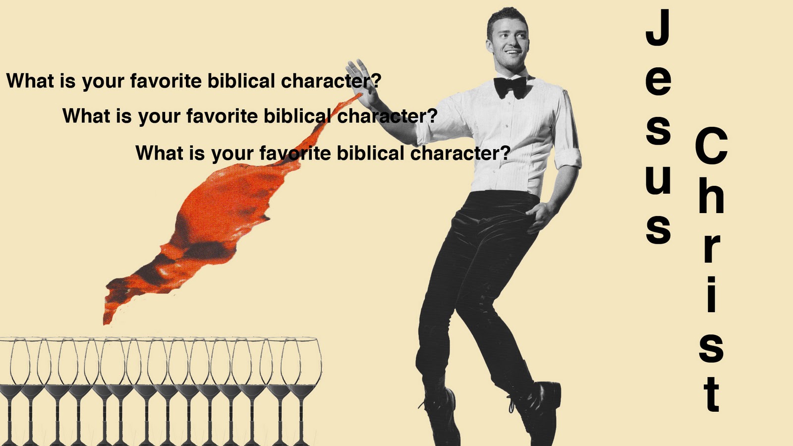 |
| Q: What is your favorite biblical character? |
Scales: Constructivism
The "Scales" assignment was my first attempt at using photoshop. This assignment was all about quantity! A long list of strange questions was handed out. The goal was to answer each one through a poster of a specific methodology using only scanned in images. We were not allowed to pull from the internet. I have broken it down into a couple of categories by the method which the question was to be answered. The first was constructivism which focused on geometric shapes and bold colors with lots of red. This out of all the styles was very difficult for me because I have problems making symmetric shapes.
Constructivism is the method displayed below.
 |
| Q: What is your best physical feature? |
 |
| Q: What is love? |
Scavenger Hunt
This was an assignment I completed in Image Methodology. You were to take pictures of six different everyday objects which shared one or more of the formal elements of design. The formal elements of design which I included are pattern, color, shape, line and value. I wanted it to be as obvious as physically possible.

Type Speciman Book
This was the major project for Typography I. It was a 20 page spread which was to include text from "The Elements of Typographic Style" by Robert Bringhurst. The context was to lie within the boundaries of a predetermined grid. This was my first big project. I changed the color scheme several times before deciding on this one. I also was still trying understand the basics of typography. Also as evident in the book, I still did not understand typographic terms such as leading, kerning and grid.
Prototype: Discrete Tetris
This was my very first encounter with the CS4 collection. It was the first assignment of Typography I my Freshman year. The assignment was to create an interesting font which was to be aesthetically pleasing while still being uniform to the rest of the font. It was challenging because I was introduced to a whole new system and did not yet know how to use it efficiently. I wanted to create a typeface which had variations in weight and did not want to have a stair step effect. It uses negative space to its advantage. I named this typeface Discrete Tetris. Discrete means detached, separate, and individually discrete. While tetris is a beloved video game which requires the player to see the forms before the falling pieces lock into place.


Subscribe to:
Posts (Atom)